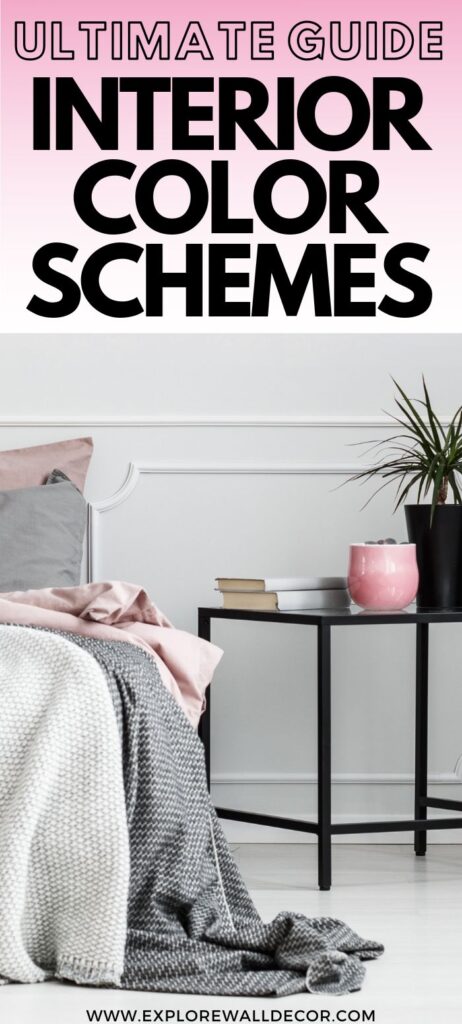
Looking for interior color combination inspiration? When it comes to interior color schemes for houses, your options are virtually limitless.
Which can actually make deciding on a color scheme feel pretty overwhelming.
Well, fear not, my friend! That’s what I’m here for. I’ve put together this ultimate guide to interior color schemes to help guide you through the process.
Today, we’re talking about the six main types of color schemes (with examples), color psychology in Interior Design, painting small spaces, and choosing wall colors that you won’t regret.
Without further delay, let’s begin.
This post may contain affiliate links and we may earn commissions when you click on the links at no additional cost to you. See our disclosure policy for more details.
Types of Interior Color Schemes for Houses
Before we dive in, let’s take a quick refresher course on the color wheel. The first step toward choosing a color scheme is understanding color theory, and the color wheel is a simple tool that can help you do so.
We see color based on how light reflects off of a surface. The segments of the color wheel represent the science behind color, and show how colors relate to each other.
As you might remember from your elementary school days, the color wheel is made up of twelve basic hues:
- Primary – red, yellow, blue
- Secondary – orange, green, purple
- Tertiary – red-orange, yellow-orange, yellow-green, blue-green, blue-purple, red-purple
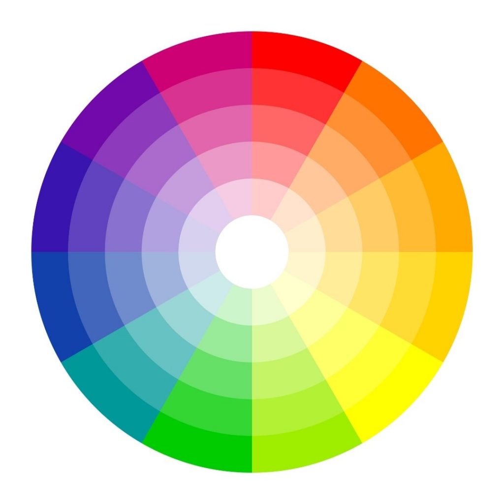
We can utilize the color wheel to put together a number of different color combinations, or color schemes, that work well together.
There are six main types of interior color schemes for houses:
- Monochromatic
- Complementary
- Analogous
- Triad
- Split-complementary
- Tetradic
Next, we’re going to break down each of these types of colors schemes, along with some examples for each of them.
Quick note: color scheme and color palette are often used interchangeably, but a “palette” is more specific, and includes the actual names, such as paint colors.
1. Monochromatic
When you think “monochromatic” color schemes for houses, you might be picturing something neutral like the room below. It has lots of white and natural materials, plus a little bit of green.
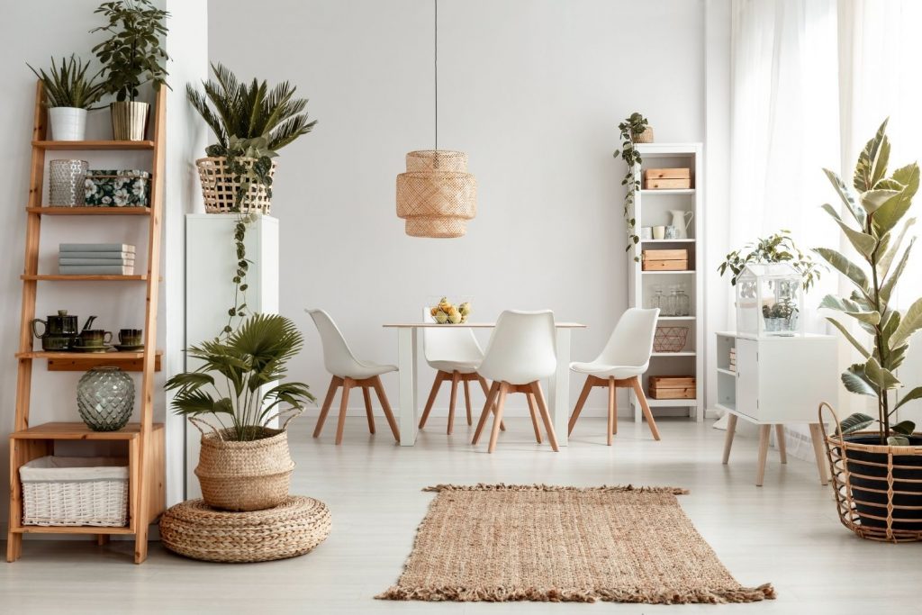
But a monochromatic color scheme consists of varying shades and tints of one color. That color could be blue, yellow, or yes — even a neutral hue like white, gray, or beige.
A “shade” of that color is a darkened version of it. In other words, black has been added to the main color.
A “tint” means that white has been added, so it’s a softer or lighter hue. (Hue is simply another word for color.)
You can create a monochromatic color scheme using any color you like — including purple. It all depends on the look you want to achieve!

As you might have noticed, the curtains in this room are a darker shade of purple, while the walls are a lighter lilac hue. This tint is simply purple mixed with lots of white.
2. Complementary
Complementary colors are two colors that are opposite each other on the color wheel.
Examples of complementary colors:
- Red and green
- Blue and orange
- Yellow and purple
- Yellow-green and red-purple
- Red-orange and blue-green
Here’s a good example of a complementary color scheme in a living room. You can see that the walls are painted green, and there are several complementary red accents strategically placed around the room.

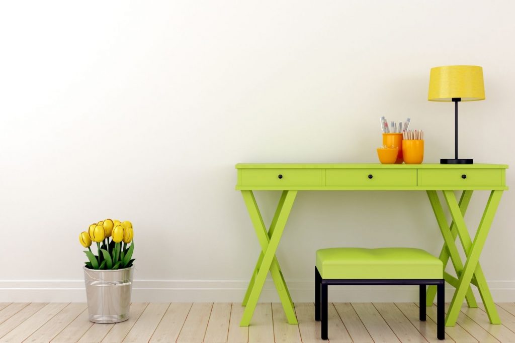
3. Analogous
An analogous color scheme consists of three colors that are adjacent to each other on the color wheel.
A few examples:
- Red, orange, and red-orange
- Blue, purple, and blue-purple
- Green, yellow, and yellow-green
Here’s an example of an analogous color scheme in action: there’s yellow on the lampshade and flowers; the desk and bench are a yellow-green; and the pen holders are a yellow-orange hue.
In the next photo, you might have to look a little harder to see the analogous color scheme. You can see that the walls lean towards an orange-yellow hue, while all of the wood has orange undertones, and the table runner has some red-orange stripes.

4. Triad
A triad is three colors that are evenly spaced around the color wheel. A couple examples are blue/yellow/red and purple/green/orange.

In the above photo, the accent pillows form a triadic color scheme: magenta (purplish-red), cyan (greenish-blue), and gold (orange-yellow). These three colors are evenly spaced around the color wheel, right next to the primary colors: red, blue, and yellow.
5. Split-Complementary
Split-complementary means that one color is chosen, along with the two that are on either side of its complementary color.
So, for example:
- blue-green + red + orange
- yellow + red-purple + blue-purple
- purple + yellow-green + yellow-orange
…and so on.
In the below photo, you might have to look closely, but you should be able to pick out a couple different split-complementary color schemes.

Were you able to find them?
The first is a blue-green (which you can see in numerous accent pieces here) with red in the wall art plus a bowl of orange fruit. The reddish-orange undertones of the wood works well in this space.
The second is red (in the wall art/wood undertones) with blue-green chairs and accessories, plus yellowish-green in the numerous plants in the space.
6. Tetradic
A tetradic color scheme includes two sets of complementary colors. Here are a few examples for ya:
- red + green and purple + yellow
- blue-green + red-orange and blue + orange
- red-violet + yellow-green and blue-violet and orange-yellow
Can you pick out a tetradic color scheme in the interior below?

You might have noticed the complementary set of red and green here, along with blue and orange. Do you see any other complementary color sets in the photo?
Psychology of Color in Interior Design
When we’re thinking about interior color schemes for houses, we don’t usually consider how colors affect our mood. Often, we’re so worried about how they look together that we forget to consider color psychology in our interior design.
But the colors we surround ourselves with can have a drastic impact on our mood.
Every color evokes a different feeling. It incites emotion. The paint colors you choose for your interior — as well as the colors of your furnishings — all work together to create a certain mood.
Every color evokes a different feeling. It incites emotion. The paint colors you choose for your interior -- as well as the colors of your furnishings -- all work together to create a certain mood.Click To TweetWikipedia describes color psychology as “the study of hues as a determinant of human behavior.” Surprisingly, it dates back to the ancient Egyptians. They actually studied the way color affected mood for the use in holistic medicine.
They believed that red can increase circulation, while orange is energizing, and that blue can soothe pain. Today, color psychology is used in marketing and architectural design, along with Interior Design.
If you want to read more on this subject, jump to this article on color psychology in Interior Design. Otherwise, bear with me as we move along to choosing wall colors.
Painting a Small or Dark Room
A common misconception is that you need to paint small, dark spaces white or light colors to brighten them up. Unfortunately, this doesn’t usually work.
The truth is that if you don’t have enough light (whether natural or artificial) then there is no color in the world that will brighten it up.
If you want to brighten up a dark room, your best bet is to improve your lighting, and then choose your wall color from there.
Otherwise, stick with a medium neutral, like taupe, gray, or even blue. You might even be able to pull off a darker color in a smaller room but that depends heavily on your specific space.
I wrote this piece on the best paint color for a dark hallway and it has a lot of great options that would also work for a small or dark room. Check it out if you’d like!
Otherwise, continue reading for more information regarding color combinations for houses.
Choosing a Wall Color That You Won’t Regret
Now that you have some ideas for your interior color scheme, it’s time to choose your wall color(s). But how do you ensure that you aren’t going to regret them immediately?
Unfortunately, it’s all too common for homeowners to buy their paint based on how a color chip looks in the store, or to buy a couple colors that they *think* will work together.
But paint isn’t cheap, and you’d be wasting your time if you had to re-do the whole thing!
Here are some pointers for choosing a wall color that you won’t regret.
- Understand color psychology. (We already covered this one above!)
- Sample before committing. You’ll want to see how the paint colors look in your home’s lighting.
- Look everywhere for inspiration. Open up your closet, flip through magazines, check out our Pinterest account.
- Understand color schemes. (We covered color schemes in this article, too!)
- Pull your paint color from artwork. This works great if you have large artwork as the focal point in a room.
- Bring the outdoors in. Got a great view? Look to nature for color inspiration.
- Understand light reflectance value (LRV). This is simply the amount of light a color reflects.
- Keep it neutral. This way you can change out your accent colors using pillows, wall art, rugs, etc.
- Utilize color apps. Many large paint brands have color visualizers to help you decide.
- Pull your paint color from a large pattern. Look for the largest pattern in the room and select a color from there.
- Stay ahead of the trends. (Rather than using a color that’s been trendy for several years already.)
- Go bold in smaller doses. Use a bold color in a smaller area or on an accent wall.
- Let your personality shine. Ultimately, the only thing that matters is that YOU like it.
(Want to read more about choosing your wall paint? This article on how to choose a wall color delves a little deeper into each of these 13 points.)

Final Thoughts on Interior House Color Schemes
In this article, we’ve covered the six main types of interior house color schemes, the psychology of color in Interior Design, and some tips for choosing a wall color that you won’t regret.
Which of these color schemes is your favorite? What colors are you most drawn toward in Interior Design? Let us know your thoughts in the comments section!
Read More:
How to Choose a Color Palette for Any Room in Your Home
5 Ideas for Your Whole House Color Palette from Sherwin Williams
5 Great Options for Your Whole House Color Palette from Benjamin Moore
I have medium oak woodwork and kitchen cabinets. Vaulted ceilings (17 ft plus) are in my open floor plan consisting of the living room, kitchen, nook, and dining room. There is also a small loft in the dining room. A large fireplace with river rock is a focal point in the living room. A chandelier is in the entryway and ceiling fans are in each room.
I really need to up-date my color scheme.
I’m thinking of changing out my maroon and off-white coloring to a soft creamy color for my walls including the ceiling.
I appreciate any advice you can give me concerning this idea.
Hi Susan – you’ll find a few creamy white options in this post: https://explorewalldecor.com/best-benjamin-moore-white/
Remember, if you have south facing windows, any yellow undertones could look really warm – which could be good or bad, depending on what you want and the undertones of any other elements in your home.
Unfortunately, I can’t give specific color options without seeing the space, but I definitely recommend trying out a few different samples to see what colors (or undertones) you prefer.
Hopefully that helps! – Tonya